
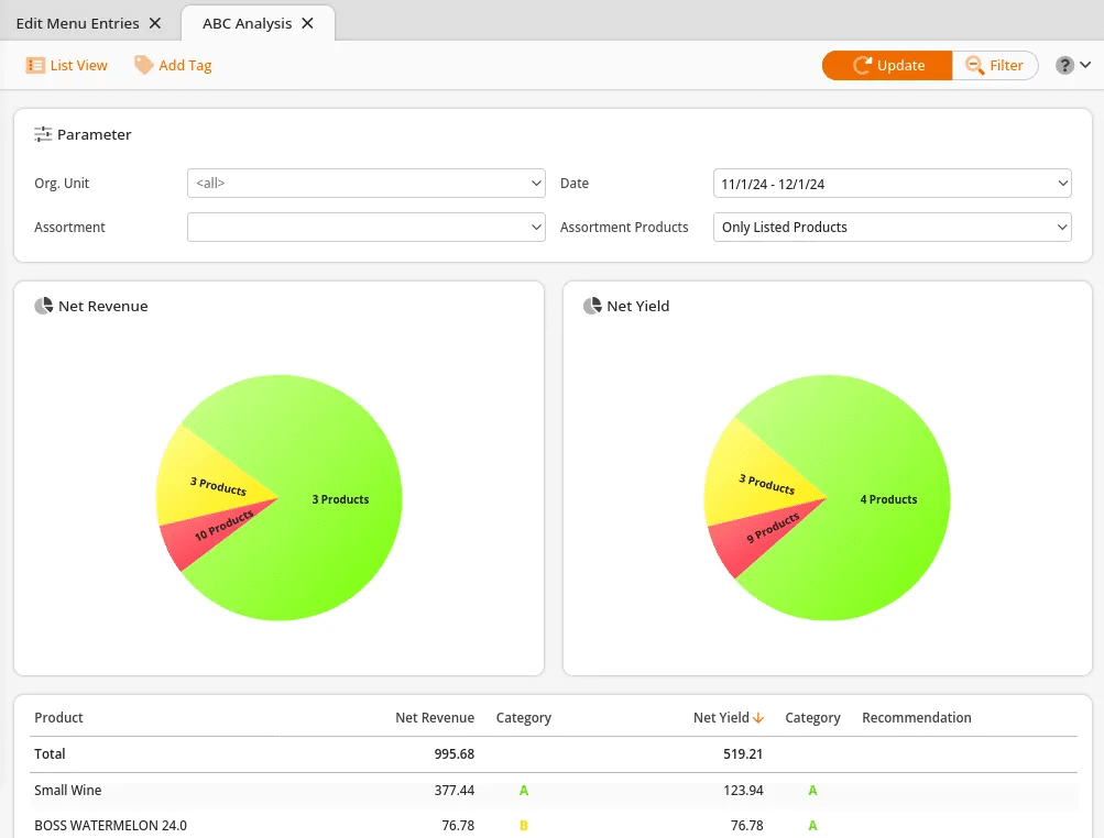
The Product ABC Analysis groups your products into three categories – A, B, and C – according to their share of your overall revenue. Products assigned to category 'A' have the biggest impact on your revenue (70%) and are reflected in green. Products in category 'B' have a smaller impact (20%) and are reflected in yellow. Products in 'C ' have the least impact on revenue (10%) and are reflected in red.
This report may be filtered by Org. Unit, Assortment, Date, and Assortment Products status. Your options are All Products or Only listed Products.
Make all the desired selections and click Update at the top of the page. Once the report loads, two pie graphs are presented. Below the graph is a list of all products. Included are the Net Revenue (total revenue from sales) and Net Yield (total Profit after losses are accounted for).
Clicking the different colors within the graphs will refresh the product results with the desired categories.
Evaluating Products
Across from each product, a category is listed for Net Revenue and Net Yield. If a product is not doing well in both revenues, it will fall within the ‘C’ category, and a recommendation to “Delist” will reflect.
If Category ‘A’ is listed for Net Revenue and Category ‘C’ for Net Yield, this entails that the products are doing well in revenue; however, they are less than 10% of the profit margin. A recommendation for those products should appear to be “Increase Price.”
If Category ‘C’ is listed for Net Revenue and Category ‘A’ is listed for Net Yield, a recommendation to “Lower Price” will appear. That’s because the net revenue for these items is low, and profits are at 70% or more.
Add Tag
Additionally, You may apply a tag to all listed products within the selected categories simply by clicking “Add Tag” and selecting a tag from the drop-down menu.

Analysis
Selecting one of the listed products will give an option for Analysis. This will redirect you to a more detailed ABC Analysis Report. You may filter by Date range. Once you have made your selection, click Update.
The first line graph you see on the left-hand side represents Revenue (Yellow) and Net yield (Green) margins according to dates. Below is a Quantities (yellow) and Stock (Green) line graph with the corresponding dates.
An accumulation of Gross revenue, Net Yield, Quantity, and Stocks are listed on the right-hand side. All of the corresponding dates for each category are listed below.

List View Report
Clicking on List View will take you to a listed view of the report that may be exported. This report can be filtered by Org. Unit, Assortment, Date, and Assortment Products.
Additionally, you may select one of the highlighted product names for these menu options:
- Edit Product, Discount Reasons
- Product Report
- Products per Weekday
- Receipts
- Stock History
- Stock Return Rates
Finally, you may export the report via PDF or Excel by selecting one from the top of the screen.
