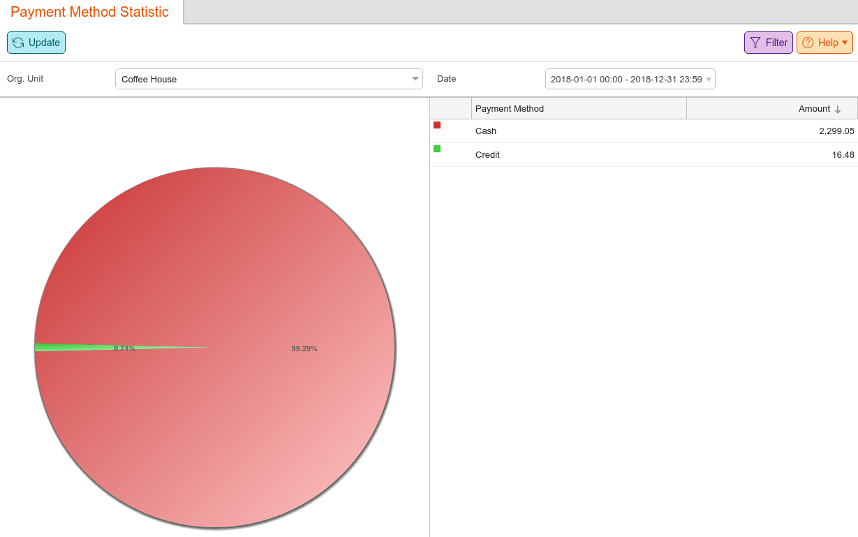
The Payment Method Statistic is a graphical percentage breakdown according to the different payment type. The left side shows the statistics in the form of a pie chart. The legend in the right column shows the summed values of the selected period for each payment method. For information on setting various methods up, you can refer to our Payment Methods manual page.
This report may be found under the Evaluations tab. If you cannot locate it there, you must Edit Menu Entries.
You may Filter this report by Org. Unit and a Date range. Additionally, you may click on a color from the circle chart to highlight the appropriate payment method on the list to the right.
Note* graph reports may not be exported.