
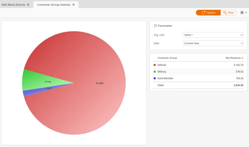
The Customer Group Statistic is a pie graph that shows how much revenue is generated by each customer group for a certain period of time.
This report may be found under your Evaluations tab. If you cannot locate it there, you must Edit Menu Entries.
Your Filter options for this report are Org. Unit, and Date Range. Once you have made the proper selections, click Update to refresh your results.
The pie chart will display a percentage of the revenue on the left-hand side. Clicking the colors within the circle graph will highlight the corresponding customer group on the list (right-hand side).
This list will also include net revenue in a monetary amount for each customer group. In the bottom-right corner, a Total accumulation of net revenue is listed.
Note* Circle graph reports may not be exported.
Note
Circle graph reports may not be exported.