
With your Products and Cashiers ready, you can create buttons to ring them up on the terminal. This page will walk you through the basic steps to create buttons on your KORONA POS terminals.
Initial Setup to Creating Buttons
Creating Buttons
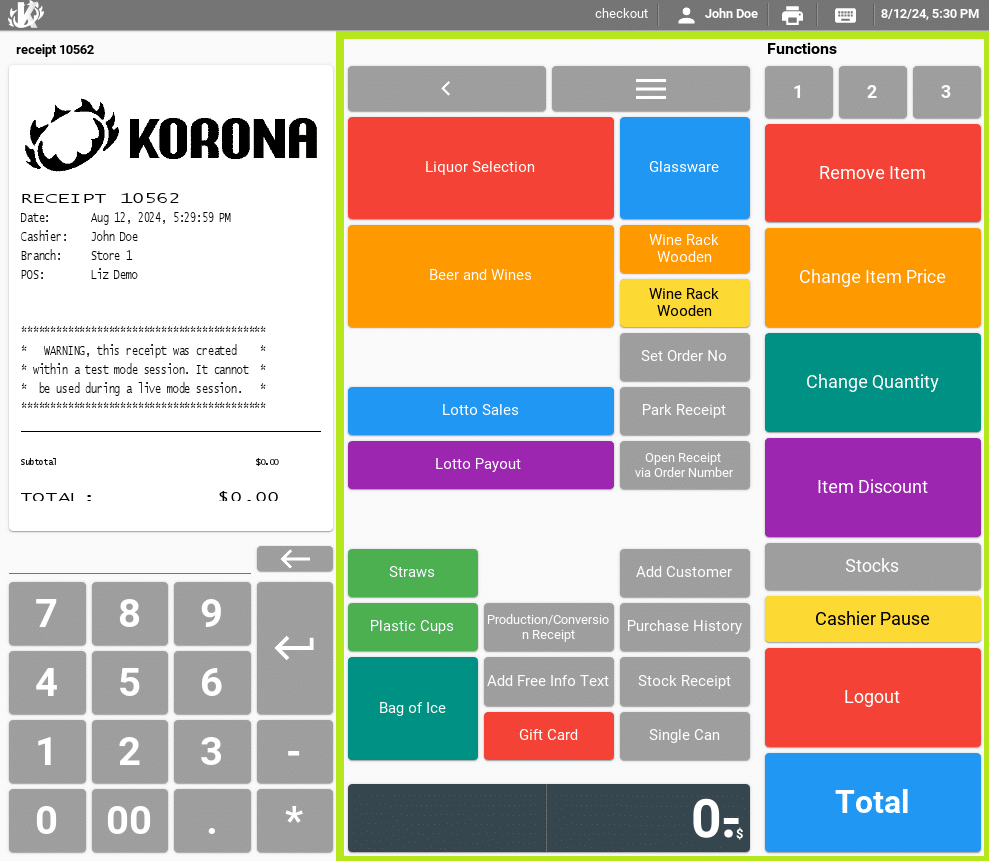
Point of sale buttons can be created and modified in the KORONA Studio back office. The highlighted section in this picture represents where you can change buttons. You can also assign custom button layouts.
Working with Button Configurations
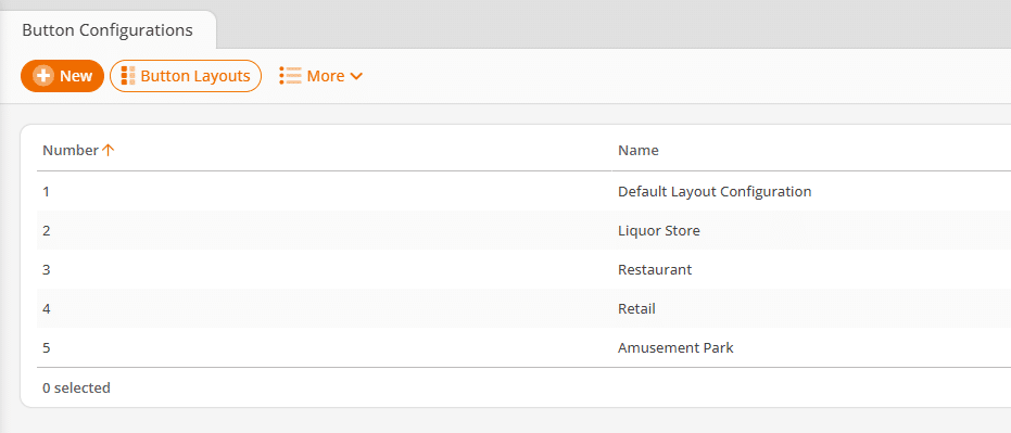
To change the layout of your POS buttons, navigate to Settings > Button Configuration.
Here, you can create and edit multiple profiles for different POS stations. You have the option to create a whole new configuration by using the +New button. You can also edit an existing configuration by double-clicking a list entry.
- The first section of the button configuration is for assigning a name.
- You can also decide whether or not the layout configuration will use Quick Keys.
- The default layout configuration will be set up with Quick Keys.
If you disable the quick key mode, the POS preview screen will change instantly. This allows you to understand better how the change might impact your cashiers.
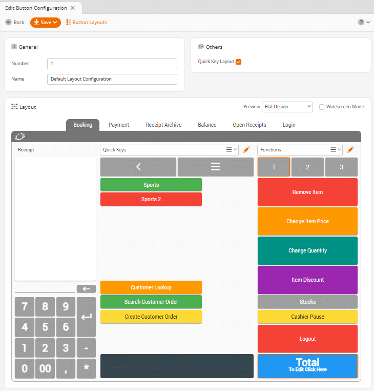
The POS preview can also be used to navigate to desired button layouts.
- To do this, click the buttons like you would at the POS.
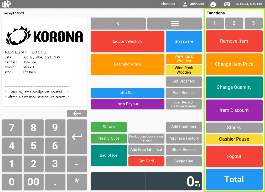
- The middle section is used for Quick Keys (if enabled).
- The right section is mainly used for POS functions. To allow space for many function buttons, the right section has three tabs (1,2,3) containing a button layout of 1×12 buttons each.
Above each section, you will find a drop-down menu that allows you to select a different button layout for the section below. There is also an orange edit button that allows you to edit the displayed button layout quickly.
Before you start, please take a look at the guide options below, which will explain some best practices:
Creating the Button Layout
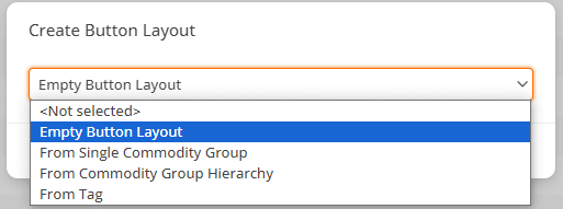
To create buttons manually, select the option “Empty Button Layout.”
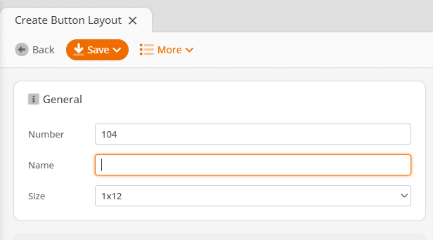
Name the button layout appropriately and select a layout size.
- A “3×12” is generally recommended for quick key layouts in the screen’s center.
- The “1×12” size option should be used for function layouts. These will appear on the right side of the POS screen.
- A special size option, “4×9,” is also on the center screen for wide-screen POS terminals. If you use widescreen button layouts, ensure you enable widescreen mode in your POS profile. (Settings > POS Profiles > Wide Screen Mode)

Creating a New Button
Select the place for your new button by clicking on one of the empty slot positions.
You will have the option to select button size and color on the left.
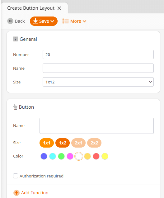
Next, add a button by clicking Add Function. This opens a dialogue box where you can select a specific function type. For our example, select the function type Button Layout. This will give you another drop-down for selecting a button layout.
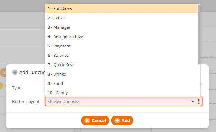
*Note: Your desired button layout may not appear in the list. You can search for it by typing in the name of the layout you need. Your layout should appear after typing the first three characters.
For a more thorough review of Buttons please reference our dedicated Button Configuration and Layout Manual page.
Available Function Types
There are many other functions you can do with buttons. The following list will explain all function types. For a list of all specific POS functions you can reference our POS Functions manual page here.
Product
The product function will allow the cashier to add a product to the receipt.
Show Products with Tag
A tag button will give the cashier the option to select a product from a list of products. The list will contain all products with the specified tag.
Cloud Report
Cloud report button allows the cashier to print a report containing data involving multiple POS terminals. For example, the cloud cashier report will print cashier sales data across all registers for one cashier.
External System Call
External system calls can display web pages which can interact with the POS using the KORONA.pos Client API. This can be used to access your web-based scheduling system, web email client or API application. You can set up external system calls under Settings > External System Calls.
Function
POS functions are the preset point of sale functions such as product search, change quantity, or customer lookup.
Info Text
Info text can be added to a line item to provide additional information. This can be used for customer requests, or to track product details on the receipt.
Account
Account transactions are very similar to product sales. However, they do not have a quantity and do not affect revenue. They can be used to track money movements like opening cash, cash drops, gift card sales or expenses.
Customer Group
A customer group button will change the customer group on a receipt. This can be used to track revenue based on customer groups. It can also trigger promotions and price groups that have been set up for a specific customer group.
Item Sequence
An item sequence button can be used to group items on the receipt. These are good for restaurant environments or sandwich shops.
Button Layout
The function type button layout is used to open another button layout by pressing the button at the point of sale.
Button Status
The button status will highlight product buttons based on a selected tag. The product status function type will allow you to select a specific tag and a color. Common scenarios are “highlight gluten-free products” or “highlight dairy products”.
Payment Method
This button function is used to add payments to the receipt. This button function type is typically used for the payments button layout. Payment method are set up and adjusted under Settings > Payment Methods.
Character / Character String
The character or character string function type can be used to have a button add certain characters into the POS input line. This is commonly used for buttons containing multiple functions.