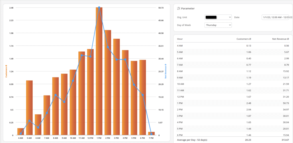
The Customers per Hour Report provides a bar chart showing the average number of customers served during each hour across a selected time period. This visual representation allows you to easily identify peak and low traffic times, helping to optimize staffing, service speed, and resource allocation.
You can filter the data by specific dates, days of the week, and other time ranges to gain more detailed insights into customer patterns. By analyzing hourly trends, you’ll be better equipped to make data-driven decisions for improving customer experience and operational efficiency during high-traffic periods.


